As an artist and art tutor, I get asked a lot which paints are the best to buy when you’re starting out. Good quality paint is fairly expensive, and walking into an art shop is a bit like walking into a sweet shop (so much choice! So many delicious things to buy!) so for watercolour beginners it can be a bit overwhelming. Which paints will allow me to make a good range of colours? Which will make a full tonal range of vibrant, bright lights through to rich, deep darks?

Dartmoor views, watercolour and ink by Anna Brewster
Well, good news, people. I’ve done all the research here so you don’t have to. AND the number of paints you need is probably a lot less than you’d think.
I’ve spent a lot of time testing, trialling and experimenting with mini-palettes which I give out at workshops, and having worked with a massive range of paints for my own work, I’ve narrowed the key colours down to eight tubes that will set your palette alight and make your paintings full of zing.
BUT FIRST - hang on, did you say tubes? Not pans?
Tubes of watercolour paint are the way to go. They are broadly comparable in price to the pans, but in terms of performance they are streets ahead. Simply decant some of the tube into an empty space in your palette and let it dry, then you can top up as needed rather than having to scrape around the bottom of the pan to get the last few dregs out.
Tube paint is easier to get on to the brush because it is less compacted than pan paint and that in turn makes it much easier to create big washes of colour, for skies and landscapes, for example.
And what about quality? Are student watercolours okay?
Well, they are okay, and if you’re on a budget, or you love painting MASSIVE artworks that require oodles of paint, then they win hands down over having no paint at all.
But who wants ‘okay’ when you can have ‘exciting’? I always advise (for ‘advise’ read ‘frequently rant about’) buying the best quality watercolours you can afford, at least for your key palette colours.
Cheap paint tends to be chalkier, less transparent, and less pigmented, all of which mean you tend to use more paint in order to get the colours as vibrant as you want them to be, and before you know it the tube is empty. So basically it’s a false economy; a tube of artist quality watercolour paint might cost a little more, but it will last a really, really long time. My favourite brands are Winsor and Newton, and Daniel Smith, both of excellent quality.

Section of ‘River walk’, watercolour and ink by Anna Brewster
So here, as they are arranged on my palette, are the watercolour paints that can make almost every colour between them, some alternatives, and why I’ve chosen them. Brace yourself: I am quite passionate about my pigments so it’s going to get a bit poetic!
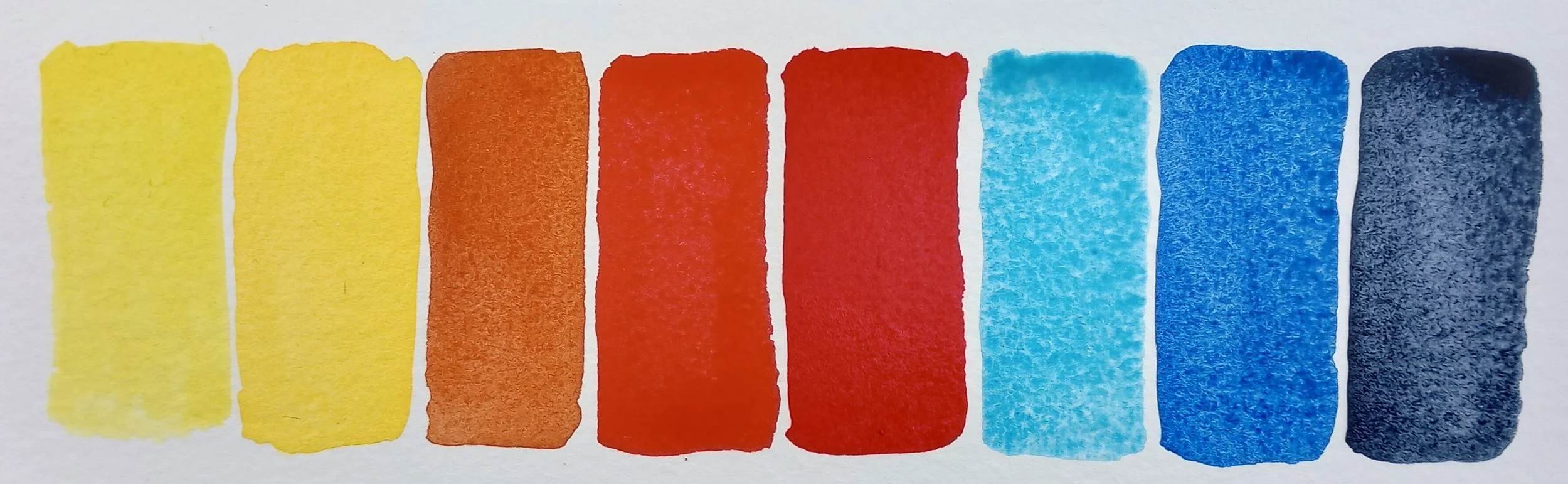
Ta da! The only paints you’ll ever need (although you’ll probably want more…)
The Amazing, All-Purpose Eight
Lemon yellow
A clear, crisp bright yellow that is really transparent and a great mixer. Lemon yellow makes delicious zingy greens, vibrant oranges, and has an incredible glow to it that shines from white paper. Buy a big tube if you can because you’ll use more of this colour than any other.
Cadmium (medium) yellow hue
I dithered over this one because cadmium yellow looks, on the face of it, a lot like lemon yellow but it isn’t. A richer, buttery warm and slightly opaque yellow, this is the perfect paint for sunsets and autumnal landscapes. I use it a lot for painting food and flowers as well, it’s sunflower yellow.
Light red
Isn’t light red at all. It’s more of an earthy terracotta, warm and sun-baked, a versatile paint for landscapes, portraits and the most incredible mixer for seas and skies, teamed with either of the blues in this palette.
Cadmium red (medium) hue / Pyrrol red
A pillar box, stop sign red, slightly leaning towards orange. This vibrant bold shade has oodles of uses but comes into its own in winter for all those holly berries, baubles and santa pics, although you’ll find it perfect for tulips, roses and all manner of other bright red things throughout the year. It mixes beautiful browns and oranges with either of our yellows.
Alizarin crimson
A deep ruby red, sumptuous and rich. Crimson is the colour I go to when I want luxurious, deep purples and mauves, or subtle warm oranges. Mixed into greens it creates amazing shadow colours, and I’d never be without this mainstay of my palette.
Cerulean blue / manganese blue hue
The colour of warm summer skies. You can mix this if you have prussian blue and white but for sheer out of the tube sunshine, this is a great purchase. I particularly love the Winsor and Newton cerulean or the Daniel Smith Manganese blue hue, the manganese is a bit gritty and textural and the cerulean is smoother so it’s more preference than anything else with these two.
Ultramarine blue / french ultramarine
This is the blue of glass bottles; a warm purple-leaning blue that glows and sings from the paper. It is very transparent and granulates easily, splitting into fascinating textures as it dries when mixed with other paints. Wonderful greens and purples can be mixed with ultramarine and of all the colours in my palette this might just be my favourite!
Indigo
Bringer of deep, dark blues, creator of shadows and depth, indigo is a workhorse of a colour, so dark on the palette that it could be mistaken for black. Indeed, you’d hardly know it existed because it’s so understated but it’s probably the most versatile colour on my palette. It’s only when you swirl in some water that it is truly revealed - the colour of bruised skies and thunderclouds, dusk falling. Indigo is an ancient colour and I love it for that reason alone.
But wait: where are the greens? The browns?

Oooo. That duck egg blue is something else. These colours can all be mixed with the palette I’ve listed.
With these eight tubes you can mix almost anything. I almost included yellow ochre (soft gold opaque paint that is great for portraits and landscapes) but it’s possible to mix a close-enough version of it with cadmium yellow and light red. Burnt umber (deep brown) didn’t make the cut because you can mix it with indigo and a smidge of yellow and red. And greens? Well, with two yellows and three blues the world is your oyster and all the more interesting for it.
So here’s the final shopping list:
Lemon yellow
Cadmium (medium) yellow hue
Light red
Cadmium (medium) red hue
Alizarin crimson
Cerulean blue / Manganese blue hue
Ultramarine Blue / French ultramarine
Indigo
If you’re getting a birthday or seasonal gift for a creative person, you can be sure that this collection will put a big smile on their face - and if you’re shopping for yourself then well done, you’re getting exactly what you need to make great progress with your painting!
And if you need a smidge of further inspiration to get started on your art journey, why not check out my YouTube channel? It’s filled with art mini-projects to inspire your creativity, with a new project added each month.
Artists out there, what colours would you choose? I’d love to hear about your go-to favourite paints.